Roger Federer is world tennis’ most beloved child. On the court, he’s the most competitive and successful player of all time. Off the court, he’s a gentleman, father and role model. You really can’t hate the man as he never puts a foot wrong. Or, so we thought.
No, we’re not talking about his recent skirmish with Greta Thunberg. We’re talking about his style – something which used to be impeccable (in fact he’s built a reputation over 20+ years as the best-dressed man in tennis) but which now is making us want to rinse our eyes with acid. And it’s all thanks to Uniqlo – the Japanese clothing manufacturer which seduced Roger with a $300m deal in 2018.
Since then, his style has taken more hits than Elvis.
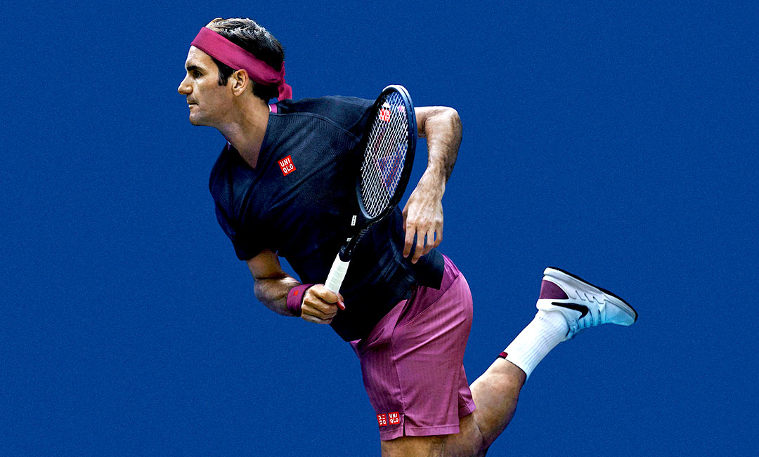
There is no doubt in our mind this is isn’t Federer’s doing; it’s Uniqlo that is responsible. Over his 20 year deal with Nike, there was nothing but cool, refined looks that built his solid reputation. After signing with Uniqlo though, we’ve seen a selection of questionable looks and the 2020 Australian Open uniform might be the worst yet (a tall order, since 2019’s was quite an eyesore too).
The accent colour is, for lack of a better word, disgusting. It’s a purple cross eggplant colour that really shouldn’t have seen the light of day – especially on the back of the tennis great Federer. The kit includes two t-shirts, one white and one navy, neither of which are particularly appealing. The white shorts are a little better but the purple shorts are an absolute atrocity; even Federer struggles to pull them off.
If you are looking for a new tennis kit, however, they are rather affordable (for good reason) at $59 AUD for the shorts or the t-shirt, but I think you’d be better off buying some of Uniqlo’s plainer clothing. It’s a real shame that somehow Federer and Uniqlo, both of which are stylish in their own right, have botched this collaboration.
Another odd result of this partnership is Uniqlo’s Roger Federer logo. It’s ‘Roger’ spelt backwards with emphasis on the ‘go’ (ЯƎGOЯ). Honestly, it looks like they put next to no effort into making the logo look good. Contrast this to Roger Federer’s personal logo that he developed when he was back with Nike, which is a stylised RF – stylish and sophisticated, like the man himself.
It’s a real shame that Uniqlo hasn’t been able to translate this into their logo, it really feels like their Federer specific collection could be for any old tennis player, not an all-time great like Roger as it doesn’t seem to reflect his personality or style one bit. I’ve got a sneaking suspicion that to get the most out of their deal with the GOAT they’re going to need to up their game, or change their colourways at the very least.
Uniqlo must be stopped. At all costs.