
“In this world nothing can be said to be certain, except death and taxes,” Benjamin Franklin once wrote.
Australians on average pay slightly less net average tax than our American cousins (23.6% vs 24%), but that idiom still holds true. Like Americans, most Australians are incredibly skeptical of where our tax dollars go to – being called a ‘dole bludger’ is one of the most offensive slurs in the Aussie lexicon (unlike comparatively friendly terms like ‘dickhead’ or ‘wanker’).
The Australian Tax Office (ATO) recently added a new feature to your tax return which breaks down where your taxes go in a handy graph, showing exactly how many of your dollars support different facets of federal public spending: economic aid, housing, education and so on.
One Aussie taxpayer shared this breakdown on Reddit, sparking a lengthy discussion about the merits of the graph and what it reveals about the government’s spending priorities. /u/boobaer13 (who must make $44,000 a year, one savvy commenter pointed out) posted this screenshot of their tax breakdown.
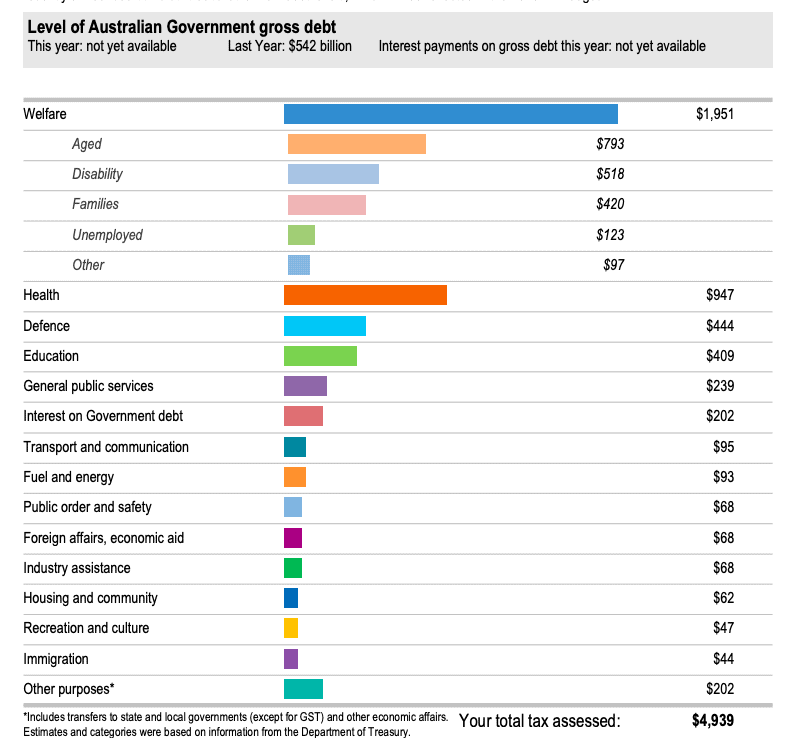
While some expenditures might be in light with the public’s perception – we’re not surprised that the government spends so much on education or defence, for example – other areas seem incredibly underfunded. That so little is spent on immigration or economic aid would certainly counter the mainstream conservative argument about their burden on the budget, for example.
What’s immediately obvious is that welfare takes up the lion’s share of our tax contributions, but within welfare, the breakdown gets more complicated. That we contribute six times more to aged welfare than unemployment benefits would come at a surprise to most Australians.
“Weirdly enough this breakdown was originally designed to sh*t on welfare in the sense that dole bludgers are scum, but it accidentally showed the breakdown to be not quite as sh*t on the unemployed… Broken clock but there you go,” one commenter astutely pointed out.
“It’s great that they break down the welfare portion,” another agreed.
“You know it won’t stop people sh*tting on the unemployed, but it’s a start.”
Another perspective: “Before the pandemic unemployment, Austudy and youth allowance were 3% of welfare payments. Yet people were still raving about them.”
Other commenters pointed out that the graph is just as revealing in terms of what it doesn’t show than what it does. For example, a significant element of education spending is contributed by the states. On the other hand, this graph doesn’t display the extent to which tax avoidance as well as government tax forfeiture (e.g. negative gearing and franking credits) affects the overall breakdown. The ‘other purposes’ category is also similarly vague, and serves to further obfuscate.
Regardless of your position on welfare, we can all agree that this graphical breakdown is a step in the right direction for the government. It’ll be interesting to see how 2020’s chief headaches (the bushfires, COVID-19 and the resulting economic fallout) will affect next year’s spend, too.