The luxury fashion industry is an exceptionally competitive one – filled with storied, centuries-old houses fiercely vying for supremacy both on the catwalk and at the mall concession.
Part of the reason these brands have had such longevity is their ability to balance their heritage and signature in-house style with new developments in the world of fashion. They evolve whilst staying true to themselves. Or at least they do when it comes to their products.
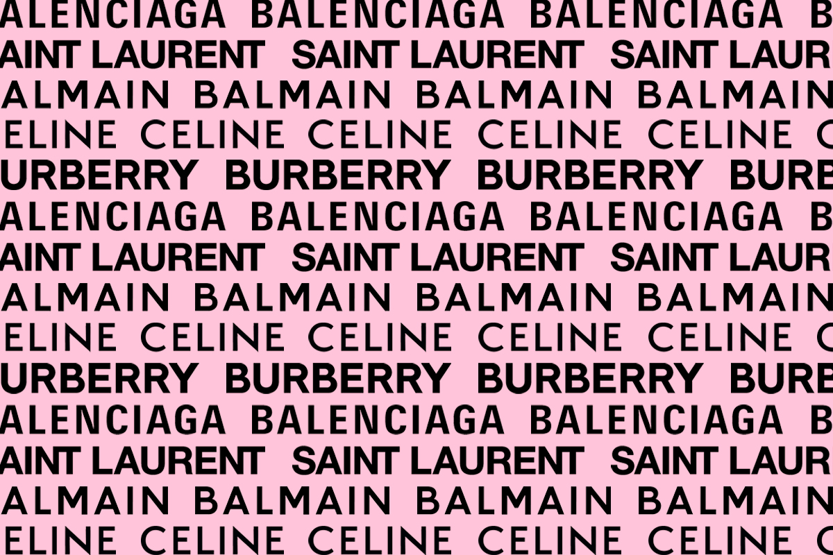
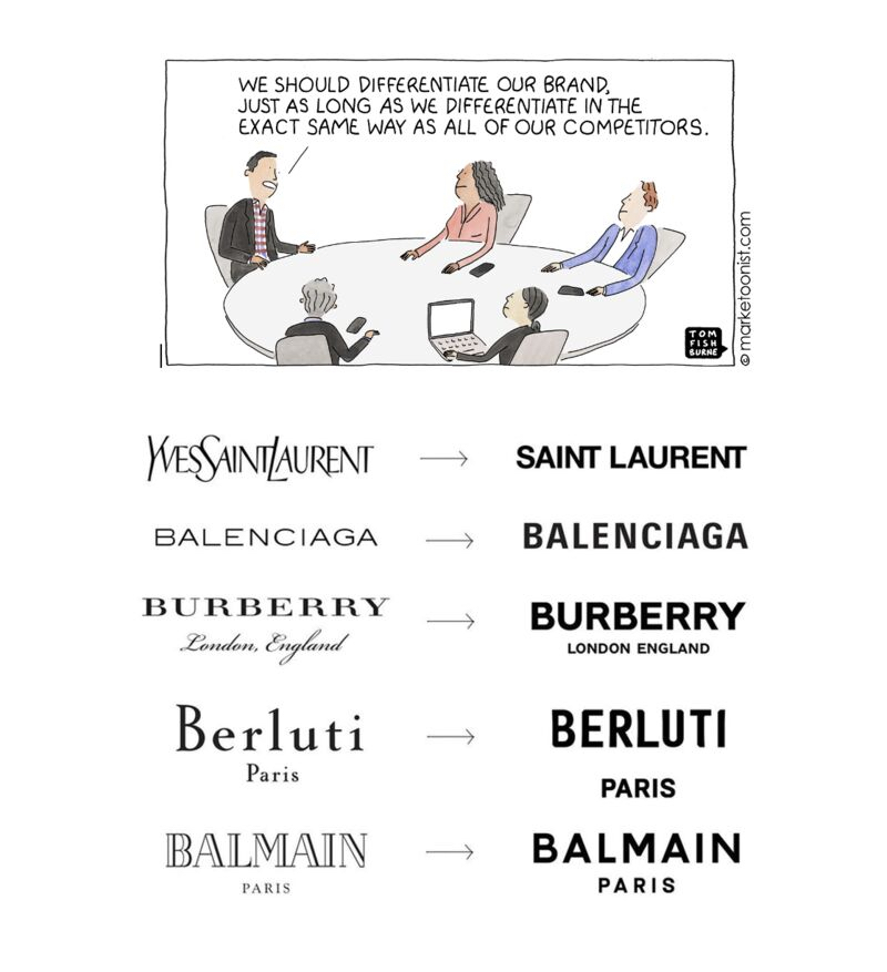
Over the last two decades, many of the world’s top luxury fashion brands – think your Burberrys, Celines and Givenchys – have eschewed their classic and often highly distinctive logos and typefaces in favour of highly minimalist, pared-back alternatives.
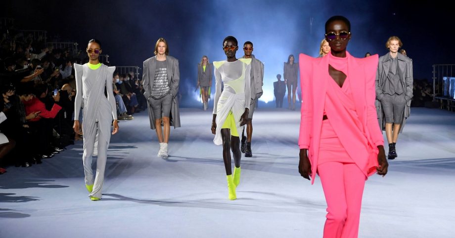
It’s particularly bizarre considering that in 2021, maximalism, as opposed to minimalism, can be considered the dominant sartorial trend luxury houses are furthering. Take Gucci’s fervent embrace of kitsch under Alessandro Michele or Balenciaga’s Triple S sneakers, which kickstarted the luxury ‘dad shoe’ trend.
What explains this trend towards overly minimal, very same-y logos? Have luxury brands lost their minds, or at least lost their sense of imagination?
DMARGE spoke exclusively with Samuel Willett, a Sydney-based designer and multidisciplinarian with particular expertise in fashion, who explains that part of this move towards minimalism is in part due to the increasingly online nature of luxury shopping.
“Minimalism in branding and typography is a key to remaining fluid in the digital-led space the majority of these brands rely upon for their messaging and ability to sell. As digital consumption continues to grow throughout 2021, there is an expectation for brands to have strong views from a political, ethical, sustainable, and environmental standpoint – all of this, while retaining the values and messaging of a luxury fashion house.”
“The implementation of minimal logotype acts as an anchor for communication across divergent narratives while giving each creative director a metaphorical clean slate, free of any past associations or history.”
In short, a minimalist logo is a blank slate. Luxury brands are almost hedging their bets: minimalist branding doesn’t tie them down to a particular aesthetic or characterisation.
You’d think that such a lack of differentiation would be a detriment to these competing brands, but Willett argues that’s not the case at all:
“Nuance is everything… The lack of distinctiveness works in their favour in [this] fast-paced, ever-changing digital landscape.”
“The amount of content and creative produced by luxury brands has increased at an exponential rate, and the strength and complexity of key visuals and art direction take precedence over the logo… These brands will always leverage other visual signifiers such as distinct features at a product level to set them apart, to drive sales and perceived value.”
That said, Willett thinks that this lack of meaningful differentiation when it comes to luxury brand logos might end up stinging these brands in the long run.
“As we head further into the era of ‘Monomass’ (as described in a 2020 Dazed report) of hyper-individualism and mass trends co-existing, I would argue that differentiation is a key deciding factor in what is driving a consumer’s emotional connection to luxury brands. As consumers start to acknowledge their power as hyper-individuals, they begin seeking the same qualities and values in the brands they look to align with.”
RELATED: $800 Balenciaga ‘Birkenstocks’ Enrage Social Media’s Luxury Consumers
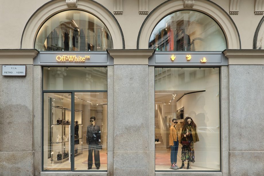
Not all brands have been chasing minimalism – indeed, some brands have gone in completely the opposite direction with their logos and branding. Off-White, for example, moved from a very minimalist, Helvetica logo to a more traditional serif font for its branding (although that iconic Swiss font and Virgil Abloh’s famous “AIR QUOTES” are still their favourite design flourishes).
The move towards minimalism in logos is a shame, actually, as some of these brands’ old logos are really beautiful – if it ain’t broke, don’t fix it – like Burberry’s or Saint Laurent’s (and bring back the ‘Yves’!)
RELATED: Europe’s Runway Fashion ‘Shutdown’ Good News For The Rest Of Us
Actually, more important than logos, we just want their stores to be open again…